ximg.es

srcset and picture generator

Choose the aspect ratio, the widths and how the image sits in the layout, and take away a ready-made <img srcset> or <picture>. The URLs are from ximg.es, so they work as soon as you paste them.

Aspect ratio
Comma-separated. Between 16 and 4000, up to 12.
Width on the page (sizes)
Modern formats (with JPG fallback) If you choose any, a <picture> is generated too.

<picture> with AVIF and WebP

<picture>
  <source type="image/avif"
    srcset="https://ximg.es/480x270.avif?text=480w 480w,
            https://ximg.es/800x450.avif?text=800w 800w,
            https://ximg.es/1200x675.avif?text=1200w 1200w,
            https://ximg.es/1600x900.avif?text=1600w 1600w"
    sizes="(min-width: 1024px) 960px, 100vw">
  <source type="image/webp"
    srcset="https://ximg.es/480x270.webp?text=480w 480w,
            https://ximg.es/800x450.webp?text=800w 800w,
            https://ximg.es/1200x675.webp?text=1200w 1200w,
            https://ximg.es/1600x900.webp?text=1600w 1600w"
    sizes="(min-width: 1024px) 960px, 100vw">
  <img
    src="https://ximg.es/800x450.jpg?text=800w"
    srcset="https://ximg.es/480x270.jpg?text=480w 480w,
            https://ximg.es/800x450.jpg?text=800w 800w,
            https://ximg.es/1200x675.jpg?text=1200w 1200w,
            https://ximg.es/1600x900.jpg?text=1600w 1600w"
    sizes="(min-width: 1024px) 960px, 100vw"
    width="1600" height="900"
    alt="Description of the image" loading="lazy" decoding="async">
</picture>

<img> with srcset

<img
  src="https://ximg.es/800x450.jpg?text=800w"
  srcset="https://ximg.es/480x270.jpg?text=480w 480w,
          https://ximg.es/800x450.jpg?text=800w 800w,
          https://ximg.es/1200x675.jpg?text=1200w 1200w,
          https://ximg.es/1600x900.jpg?text=1600w 1600w"
  sizes="(min-width: 1024px) 960px, 100vw"
  width="1600" height="900"
  alt="Description of the image" loading="lazy" decoding="async">

Preview: which image does your browser choose?

Description of the image

What srcset and sizes do

srcset gives the browser a list of versions of the same image with their real width (800x450.jpg 800w). sizes tells it how wide the image will be on the page depending on the screen size. With both, and knowing the screen’s pixel density, the browser picks the smallest file that still looks sharp. It decides before laying out the page, which is why you have to tell it with sizes.

How to choose the widths

img with srcset or picture

If only the size changes, <img srcset sizes> is enough. You need <picture> to offer formats that not every browser understands: each <source> has a type and the browser uses the first one it can read, so AVIF goes before WebP and the JPG in the <img> is the fallback. It’s also used for “art direction”: different crops for different screens, with media.

Details people forget

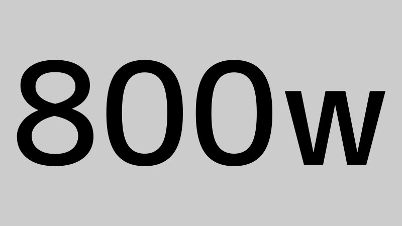
The URLs in the code come from the ximg.es generator and each image has its width written on it, so you can paste the HTML into your layout and see at a glance which version loads on each screen. When you have the real photos, just swap the URLs.

Frequently asked questions

What’s the difference between srcset and sizes?

srcset lists the available files with their real width; sizes says how wide the image will be on the page. The browser combines both with the screen density to choose.

What happens if I leave out sizes?

The browser assumes 100vw, the full screen width, and on desktop it will download far bigger images than needed if the image sits in a column.

Why does the browser download a bigger image than I expected?

Because of pixel density: on a 2x screen, an image 400 px wide needs an 800 px file. Also, if it already has a larger version cached, it may use that instead of downloading the small one.

Do I need picture to use WebP or AVIF?

Yes, if you want a fallback for browsers that don’t support them. Today every browser reads WebP, so many sites already put WebP straight into the srcset of the <img>.

Does every source in picture need sizes?

Yes, every <source> with w descriptors needs its own sizes. The <img> inside has one too for the fallback format.

Can I use these ximg.es URLs in production?

They’re placeholders: they’re for building layouts and checking the browser picks correctly. When you have the real images, replace the URLs and keep the same widths.

More tools

See all tools · Placeholder image generator