What the contrast ratio measures
It compares the luminance of the text with that of the background, on a scale from 1:1 (the same colour) to 21:1 (black on white). It doesn’t depend on hue: a red and a green with the same luminance have very low contrast even though they look very different, and that is exactly the pair colour-blind people can’t tell apart.
AA and AAA levels
- AA, normal text: 4.5:1. The minimum required by most accessibility laws, such as the European directive and the EN 301 549 standard.
- AA, large text: 3:1. Text counts as large from 24 px, or 18.66 px in bold (18 and 14 points).
- AAA: 7:1 and 4.5:1. The enhanced level. Recommended for long texts such as articles or documentation.
- Icons and controls: 3:1. Form field borders, icons without text and the focus indicator (criterion 1.4.11).
The ratio isn’t rounded: 4.49:1 fails AA even though it’s a hundredth short. That’s why the lightest grey that passes
AA on white is #767676 (4.54:1), and #777777 no longer makes it.
How to fix insufficient contrast
The simplest fix is to darken the text (or lighten it, if the background is dark) without changing the hue, which is what the tool’s suggestion does: it keeps the brand colour and only adjusts the lightness. If the colour can’t be touched, use it on large elements such as headings or button backgrounds, and keep small text in a higher-contrast colour.
Text over images
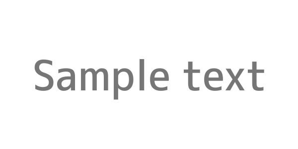
The contrast of text over a photo changes from point to point, and no tool can guarantee it. The safe approach is to put a semi-transparent colour layer or a gradient between the photo and the text, and check the worst case. The preview uses an image from the ximg.es generator with the same colours, so you can see how a placeholder’s text looks:
https://ximg.es/600x300/{background}/{text}.png?text=Hello